The Goal:
To design a powerful and welcoming logo for “Nepali in Canada,” a social page for the Nepalese community. The key was to create a visual identity that celebrated both Nepali heritage and Canadian life, fostering a sense of unity and belonging.
My Design Process:
I focused on creating a design rich with symbolism, ensuring every element told a piece of the Nepalese-Canadian story.
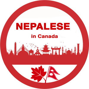
The Central Symbol: The core of my concept was the fusion of two iconic symbols: the Canadian Maple Leaf and the unique flag of Nepal. I designed them to grow from a single point, creating a new, hybrid emblem that represents a blended identity—honoring roots while thriving in a new nation.
The Skyline of Unity: Above, I crafted a silhouette that includes a variety of Nepalese cultural and religious landmarks (a stupa, temples, a church, a mosque). This was a deliberate choice to show that the “Nepali in Canada” community is inclusive and welcomes people from all backgrounds and faiths.
The Circle of Community: The entire logo is enclosed in a bold, red circle. This shape represents wholeness, protection, and the strong, supportive network the community provides. The powerful red-and-white color scheme is drawn directly from both national flags, creating an instant connection.
The Outcome:
The final logo is a clean, memorable, and meaningful emblem that proudly tells the story of the Nepalese journey in Canada. It serves as a strong visual foundation for the brand, immediately communicating its values of heritage, unity, and success.